Chapter 11 Bonus
Dans cette partie, nous allons produire un même graphe avec différentes approches.
11.1 R de base
plot(x = exprs$A, y = exprs$M, main = "MA plot",
       col = "blue", pch = 16, xlab = "A = intensity", ylab = "M = log2FC")
grid(lty = "solid", col = "lightgray")
abline(h = 0)
11.2 ggplot2
library(ggplot2)

g <- ggplot(data = exprs, aes(x = A, y = M)) +
  geom_point(aes(A, M, colour = factor(ifelse(abs(M) <= 1, 1,2))), size = 0.8) +
  geom_hline(yintercept = c(-1,1)) +
  scale_color_manual(values = c("black","red")) +
  ggtitle("MA plot") +
  labs(y = "M = log2FC", x = "A = intensity") +
  theme_light() + theme(legend.position = "none")
g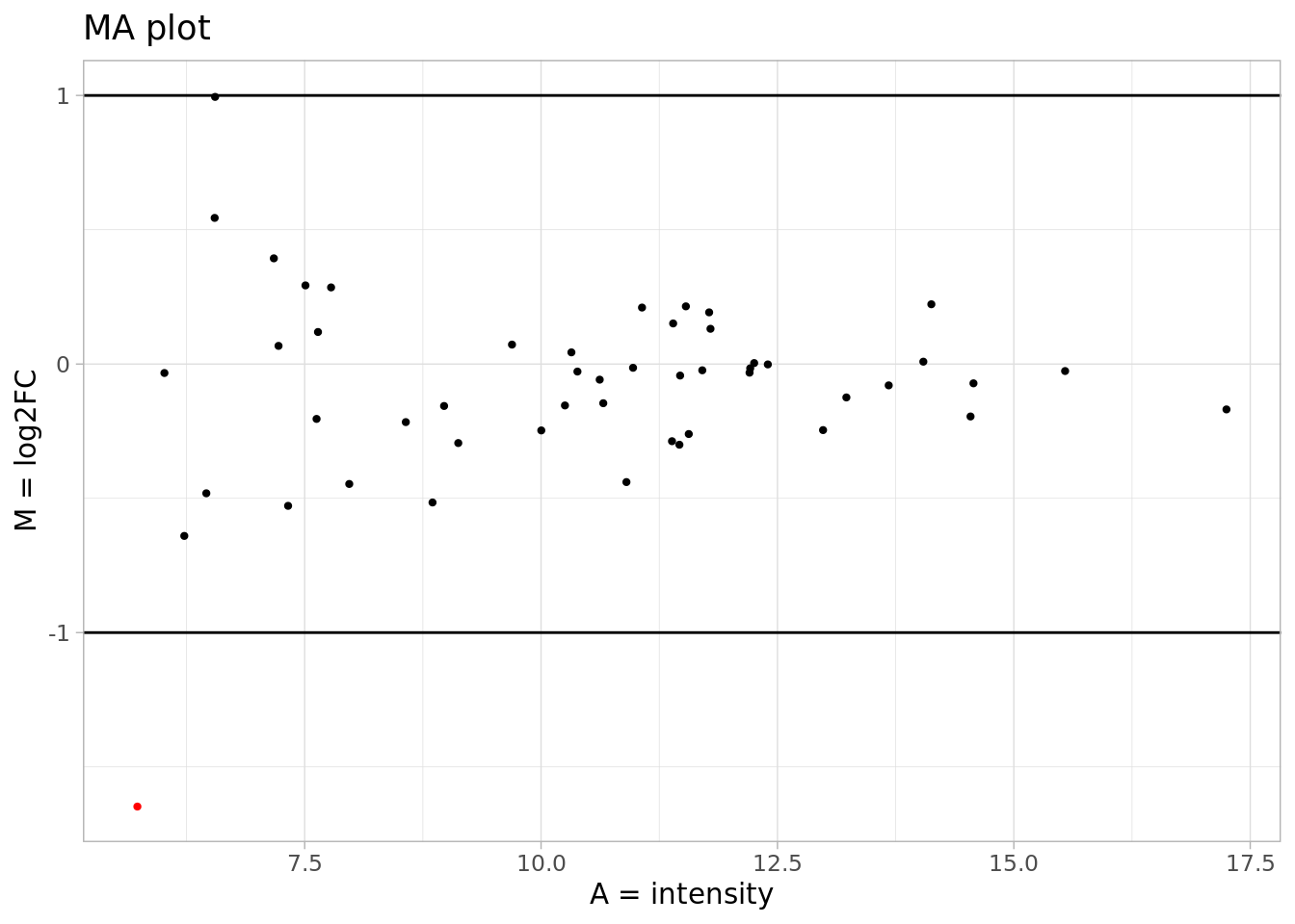
11.4 echarts
library(echarts4r)
library(dplyr)

exprs_annot  %>%
  mutate(interst = ifelse(abs(M) <= 1, 1,2))|>
  group_by(interst)|>
  e_charts(A) |>
  e_scatter(M, bind = name, symbol_size=10) |>
  e_legend(FALSE) |>
  e_tooltip() |>
  e_color(
    c("black", "red")
  ) |>
  e_title("MA plot") |>
  e_axis_labels(y = "M = log2FC", x = "A = intensity") |>
  e_toolbox_feature(feature = "saveAsImage")  |>
  e_toolbox_feature(feature = "dataZoom")  |>
  e_toolbox_feature(feature = "dataView") |>
  e_mark_line(data = list(yAxis = -1.5)) |>
  e_mark_line(data = list(yAxis = 1.5)) |>
  e_tooltip(
    formatter = htmlwidgets::JS("
      function(params){
        return('<strong>' + params.name +
                '</strong><br />M: ' + params.value[1] +
                '<br />A: ' + params.value[0])
                }
    ")
  )